
Overview
For a project in my UX/UI certificate, I was asked to come up with a mobile app that solves a problem that I have. The app I created, Shuffle, is a database of card game rules that allows the user to search, save, and submit card game rules as well as keep score of their games.
Role:
Sole contributor
UX/UI
Timeline:
4 weeks
Concept Development
In the thick of COVID-19 quarantine, I was struggling to find activities that felt engaging and did not involve staring at a screen. I love playing card games, but most of the games I know involve more than three people, and I was quarantining with only one person. I wished there was an app that had a database of two-player or solitaire card games and their rules, but every app I found had blind-spots. I thought users should be able to filter search results based on age range and number of players, as well as keep score of their games within the app. Below are some of my notes while brainstorming what the ideal card game database app would look like.


Understanding The User
I was instructed to come up with fictional personas of Shuffle’s potential users. I determined that the target users of my app would contain a broad spectrum of people, but ultimately they’d be those who value tradition and want to discover and share new games to play with their loved ones.
User Personas:
Phil, 45. Delaware
Mid-level employee at an accounting firm, but has been furloughed during the COVID-19 pandemic.
Has 4 kids, ages 9-16.
Loves to fish and hike, but his children are homebodies. He wants to find activities that they can enjoy safely as a family.
Miranda, 24. Oklahoma.
Working from home during the COVID-19 pandemic.
Has 3 roommates.
Typically spends the evenings scrolling social media, but feels burnt out and needs a break from staring at her screen.
Client Needs:
User Needs:
Ensure that card games are accessible by providing understandable rules
Provide users with an opportunity to unplug from technology and connect with their loved ones
Provide an intuitive searching system
Enable users to submit their own games to the database
Discover new card games
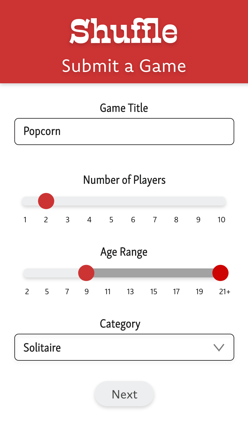
Search by popularity, game type, number of players, and/or age range
Save games to favorites
Be able to submit games to the database
Roadmap
After determining who my audience was and what the app needed to accomplish, I created a content map of Shuffle. The main feature is the catalog and search functions, so I made sure that was the first screen the users see. I hid the other features behind a hamburger menu so as not to overwhelm the user with a busy-looking screen.
From there, I fleshed out an interaction map to help ease the wireframing process. At this point, I determined that drop-down menus would be an adequate solution for filtering search results.
Content Map:
Interaction Map:
Wireframes:


Mocking It Up
With a very clear vision of how Shuffle would function, I began mocking up high fidelity screens in Adobe XD. Because the app is very text-heavy, I wanted the UI to be simple and readable. For the logo and color palette, I drew visual inspiration from a classic deck of cards.
prototypes:


Lessons Learned
User Research:
As I have continued to study UX, I’ve become aware that designing for real people is crucial. For this project, I was not instructed to conduct research, but imagine what my users might want or need. I believe that actually conducting user interviews, and research to validate user goals and needs against the business requirements would be invaluable to user-centered design.
User Interface:
This app was not meant to be overly visually stimulating, it was meant to be the Minimum Viable Product for release 1. Given the chance to improve upon this project in further releases, I would expand the card deck UI theme further and introduce card shuffling animations as the user moves from screen to screen.