Overview
For the final project of my UX/UI Certificate, I was asked to dream up a restaurant that was delivery only and create their website and ordering process. My restaurant, Presto! Pasta, is a fictional restaurant in Denton, Texas that delivers healthy, customizable pasta dishes to busy college students, instructors, and young professionals.
Role:
Sole contributor
UX/UI
timeline:
8 weeks
Understanding The User
User Personas:
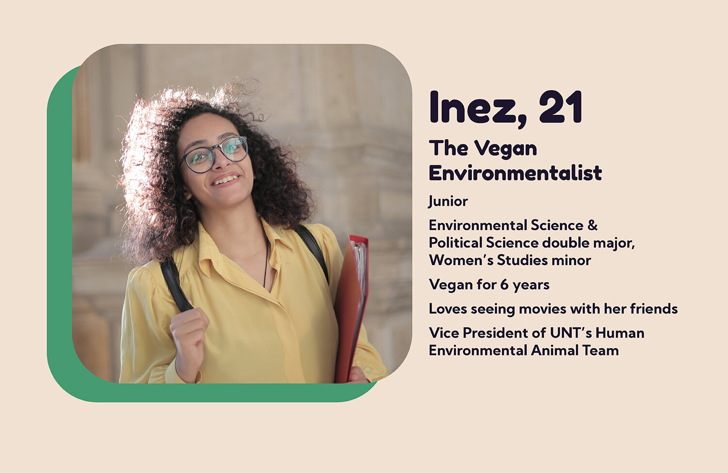
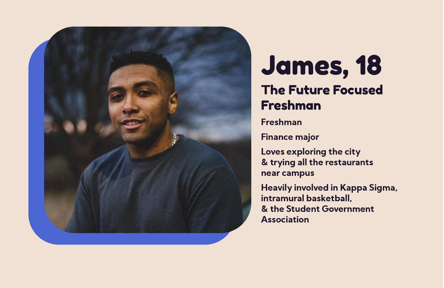
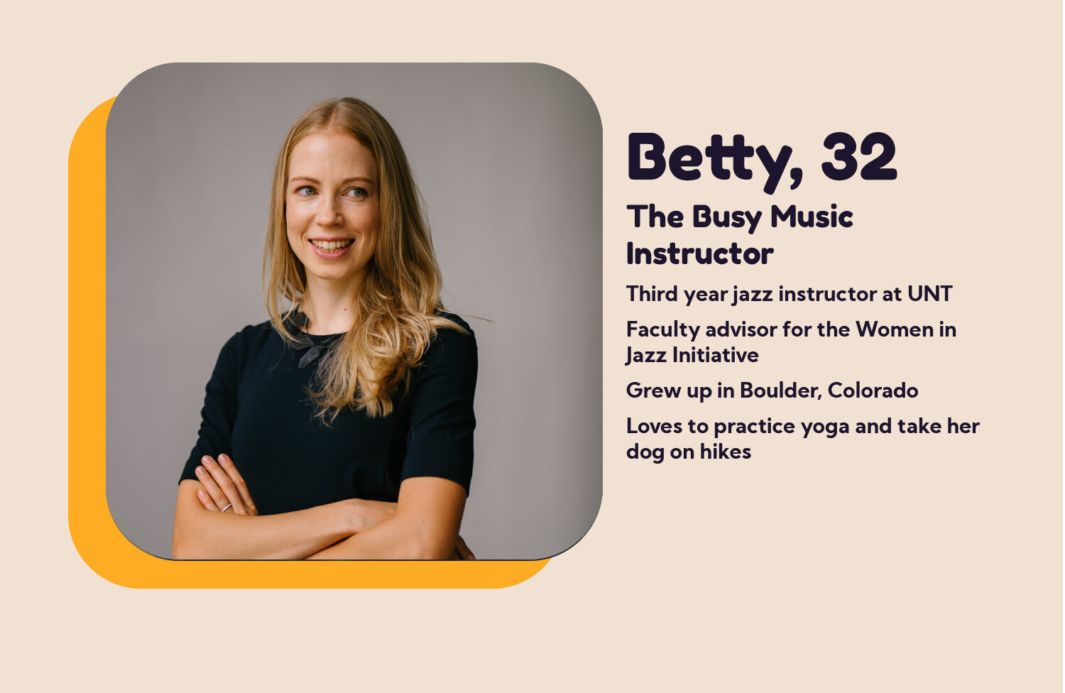
As a former resident of Denton and student at UNT, I had a strong grasp on my target users. Due to the time constraints given on this project and the COVID-19 pandemic, I was not able to meet with real potential users, so I used the knowledge that I had.
I knew that a quick, healthy food option would appeal to a wide audience, so I needed the personas to represent a wide variety of Denton residents. For example, like many folks I knew as a student at UNT, Inez is an academically-driven, vegan environmental activist. I’ve noticed how tedious it can be to determine whether or not a meal is vegan, so I made sure to include vegan symbols next to all appropriate items. It would also be important for her to know that Presto’s food was ethically sourced. For James, a Finance major with a jam-packed calendar, it was important that ordering a meal would be a quick, easy fit into his busy life. Additionally, Denton residents tend to be hip and environmentally conscious, which influenced the organic, loose style of illustration and emphasis on ethical practices and healthy options.
User Needs:
Find out if the restaurant delivers to their area
Order food online
Customize food order
Make sure the food they’ve selected meets their dietary restrictions
Be able to view past orders
Client needs:
Sell food online to be delivered
Provide a system for order customization
Communicate eco-friendly, sustainable practices
Communicate fast services
Communicate affordability
Roadmap
Once I had a grip on my audience, I fleshed out a content map in Adobe Illustrator to determine what necessary items needed to be on the webpage. Additionally, I created an interaction map for the ordering process, as that is the main function of the website.
Content Map:
Ordering Interaction MAp:
To test the intuitiveness of the interaction map, I gave a remote tree test via TreeJack to past and current UNT students as well as people across the country, from Los Angeles to Boston, who fit the young professional/college student demographic.
Tree test results:
100% of users successfully found the path to change their billing information via “Account.”
90% of users successfully found the path to see their past orders.
60% of users initially clicked on a page entitled “Order” to find their past orders. I decided to eliminate this page and combine the ordering process and the menu on one page entitled “Menu.”
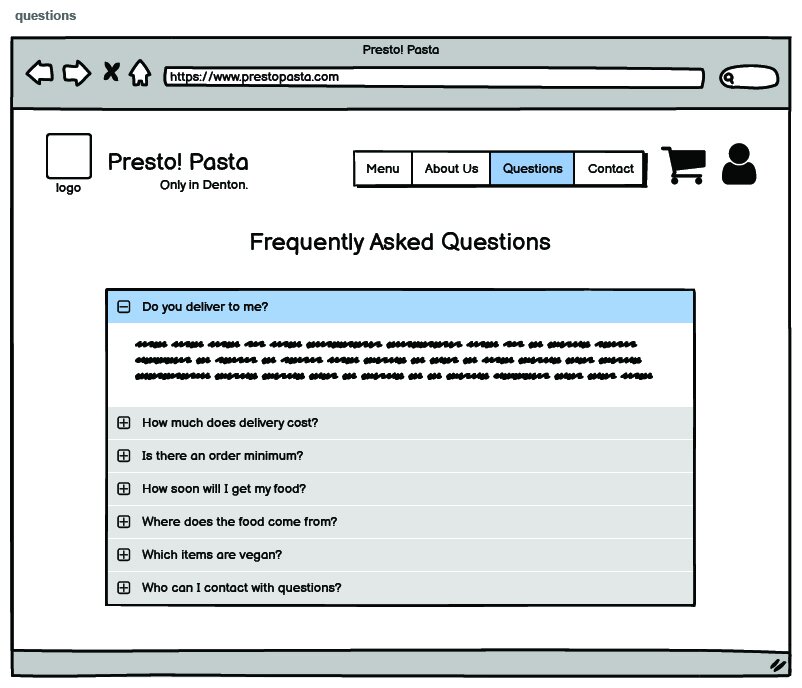
100% of users found information about the restaurant’s ethical sourcing via either the FAQ page or the About Us page.
wireframes:
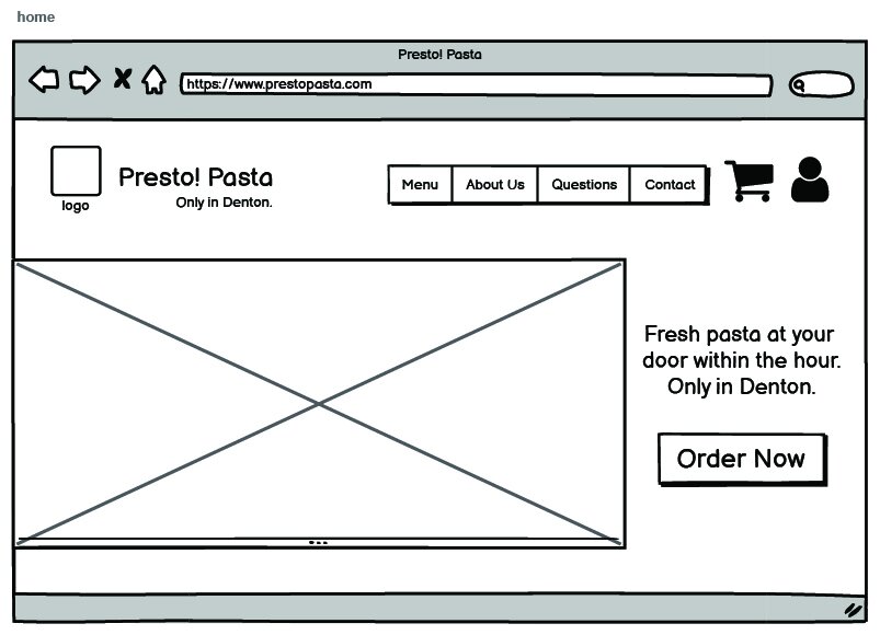
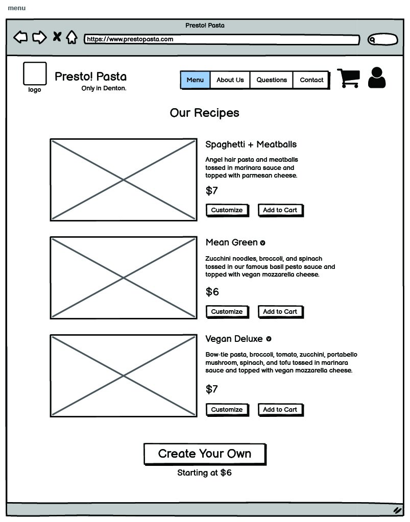
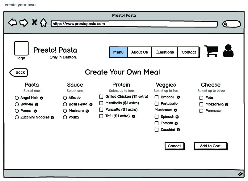
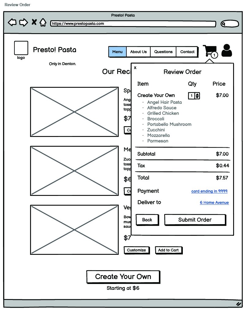
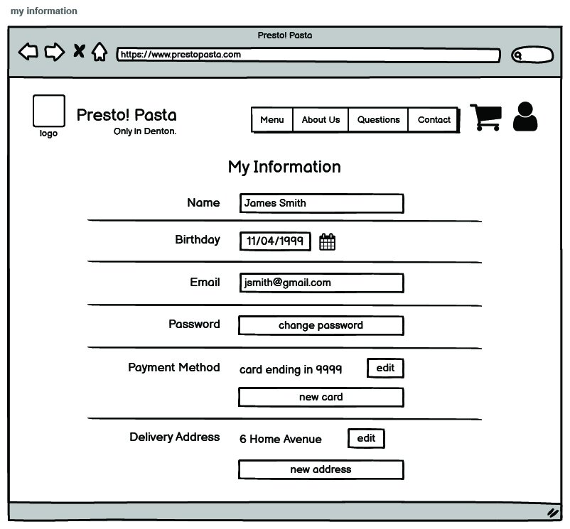
After making adjustments based on the tree test results, I began developing wireframes in Balsamiq. It was crucial that ordering a meal needed to be a quick and easy process, so I made the ordering and menu buttons very prominent. I also decided to keep the customization process on one page instead of splitting it up, so the user understands all of their options at once.
Finalizing the Look
Moodboard:
Once I had a handle on the content and general layout of the website, I began to dive into the UI elements of this project.
I was interested in colorful, organic looking illustration as the dominating force behind the website’s look since Denton has a very creative and cool vibe about it.
Drawing inspiration from Pinterest and Behance, I created a moodboard and began illustrating a woman eating pasta to be featured on the home page.


Mocking It Up
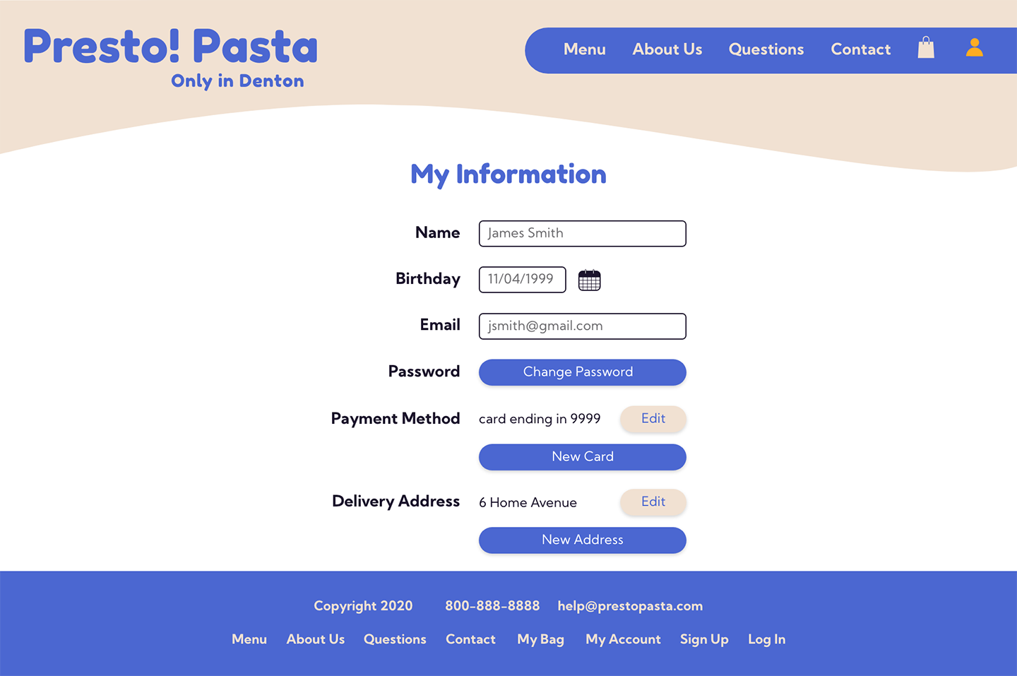
Keeping my users in mind, I mocked up about 15 pages in Adobe XD. I chose a calming color scheme for the main elements of the website and simple illustrations for the food items so the users feel at ease while ordering from Presto! Pasta.
Prototypes:


Lessons Learned
user Research:
Actual user research was not required in the course for which I completed this project, but I wish I’d had the bandwidth to conduct proper, in-person user interviews. It would have been very valuable to sit down with current staff and students at UNT and TWU and asked about their ideal online meal ordering processes.
User Interface:
I was really interested in experimenting with the illustration style and I love the outcome, but in hindsight, I don't feel that it's the most appropriate for a pasta restaurant. For example, I would include photos of the pasta dishes rather than illustrations. Seeing real pictures of the food helps the user trust the restaurant’s quality.